Selected work

A closer look at the products, systems, and tools I’ve designed and the thinking behind them.

G-Network case study cover

G-Network

A telecom operations platform redesigned to unify complex workflows, internal tools, and customer management in one clearer system.

Fomoless AI news product case study cover

Fomoless

An AI-assisted news product that organizes essential updates into a calmer, focused, and distraction-free reading experience.

Thumbnail Grabber case study cover

Thumbnail Grabber

A lightweight YouTube tool for extracting high-resolution thumbnails fast, making visual research, comparison, and documentation easier.

LOSA aviation safety platform case study cover

LOSA

Coming soon

An aviation safety platform that turns complex observation data into clear dashboards, benchmarks, and operational insights.

G-Network

G-Network Ecosystem - 2025

G-Network operations dashboard with installation charts and reporting data

My role

Product Designer

Design System, Product Strategy,
Information Architecture, Interaction Design,
Visual Design, Prototyping, and UX
documentation.

Team

  • Danilo - Leader
  • Samuel - Coordinator
  • Jeykher - Full Stack
  • Rainier - Back End
  • Isaac - Front End
  • Jeremy - Front End
  • Carlos - Back End
  • Debby - QA

Overview

One ecosystem, several connected experiences

G-Network operates through multiple digital products used by different teams across the company.

My work focused on creating a consistent product language, simplifying complex workflows, and making the experience clearer across desktop and mobile.

Timeline & Status

6 Months , Launched in February 2025

The Challenge

Bringing consistency to a complex product ecosystem

The products contained dense workflows, operational information, tables, forms, statuses, and actions used throughout the company.

The challenge was not simply redesigning individual screens. It was creating a system flexible enough to support different products without losing consistency, clarity, or usability.

The experience needed to work for teams managing customers, installations, payments, tickets, infrastructure, agents, and support conversations.

Core challenges
  • Create consistency across different products
  • Simplify complex operational workflows
  • Improve hierarchy in information-heavy interfaces
  • Design reusable patterns for desktop and mobile
  • Make frequent tasks easier to understand and complete
  • Support future product growth without redesigning everything again
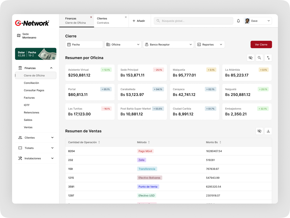
G-Network finance dashboard showing office summaries and a sales table
ImageFinance Dashboard

Design System

Creating a shared product language

I created a design system to establish a consistent foundation across the G-Network ecosystem.

The system defined how products should look, behave, and communicate. It helped align typography, spacing, colors, components, interaction states, and reusable interface patterns.

The goal was to create a visual language that could scale across internal tools, mobile experiences, and customer support products.

The system included
  • Color and typography foundations
  • Spacing and layout rules
  • Buttons and form controls
  • Tables and data presentation
  • Modals and side panels
  • Statuses, alerts, and feedback states
  • Navigation patterns
  • Empty, loading, and error states
  • Responsive component behavior
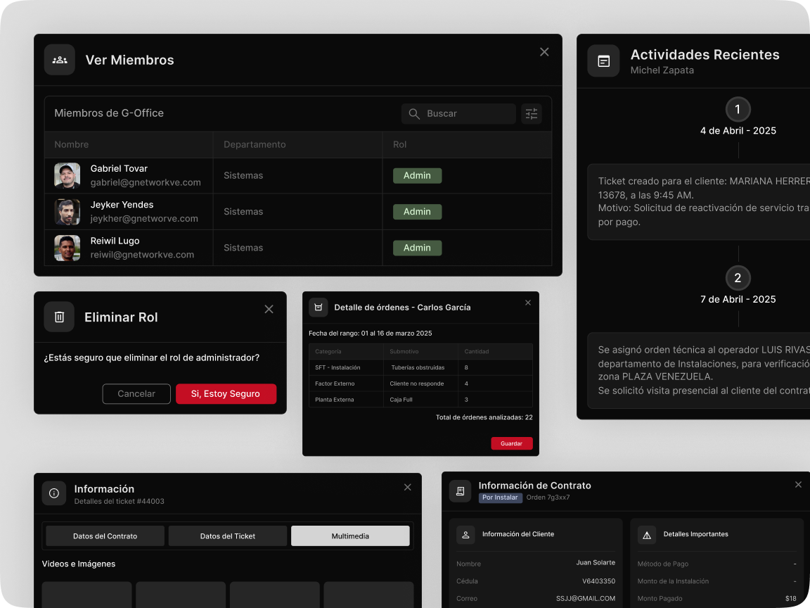
Dark G-Network interface components including member lists, dialogs, activity, and contract panels
ImageComponents

G-Force

Making complex operations easier to navigate

G-Force is the internal product used to manage G-Network’s daily operations.

The platform supports multiple areas of the company, including customer management, installations, finance, tickets, infrastructure, agents, teams, schedules, and system settings.

Key areas redesigned
  • Customer registration and management
  • Installation orders and scheduling
  • Financial reconciliation
  • Tickets and support operations
  • External infrastructure management
  • Agents, teams, and schedules
  • Productivity and reporting
  • System settings
Design approach

I standardized recurring patterns such as tables, filters, forms, actions, statuses, and modal workflows.

This made the experience more predictable and reduced the need for each module to solve the same interaction problems differently.
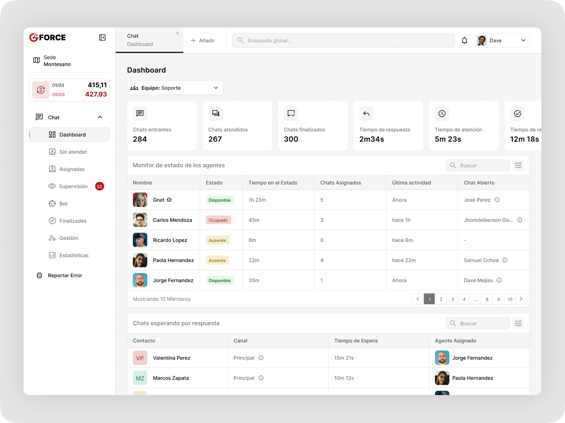
G-Force support dashboard showing chat metrics, agent status, and waiting conversations
ImageChat Dashboard

Mobile Application

Extending the ecosystem beyond desktop

The mobile application brought key G-Network experiences into a smaller and more accessible format.

The challenge was not to shrink the desktop product, but to identify what mattered most on mobile and redesign those experiences around limited space, touch interaction, and faster access.

I adapted the visual language and components from the design system while preserving the identity of the wider ecosystem.

Design focus
  • Clear mobile navigation
  • Simplified information hierarchy
  • Touch-friendly actions
  • Reusable mobile components
  • Consistent statuses and feedback
  • Focused flows with fewer distractions
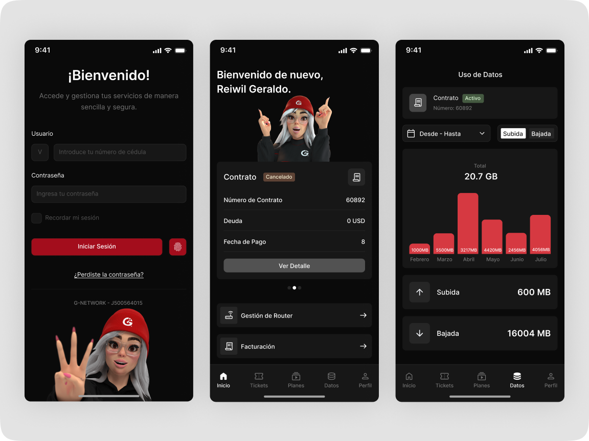
Three dark G-Network mobile application screens for sign in, account details, and data usage
ImageMobile App Screens

G-Office Chat

Giving support teams the context they need

G-Office Chat was redesigned to help support teams manage conversations while keeping important customer information visible.

The experience was structured into three connected areas:

  1. Conversation list
  2. Active customer conversation
  3. Customer summary and operational context

This allowed agents to communicate with customers without constantly leaving the conversation to search for information elsewhere.

Customer context included
  • Customer information
  • Active contracts
  • Outstanding debt
  • Tickets and requests
  • Service status
  • Conversation history
Supporting interactions
  • Pin conversation
  • Mark as unread
  • Mute conversation
  • Quick responses
  • Conversation statuses
  • Empty states
  • Agent and team management
  • Productivity and response-time metrics
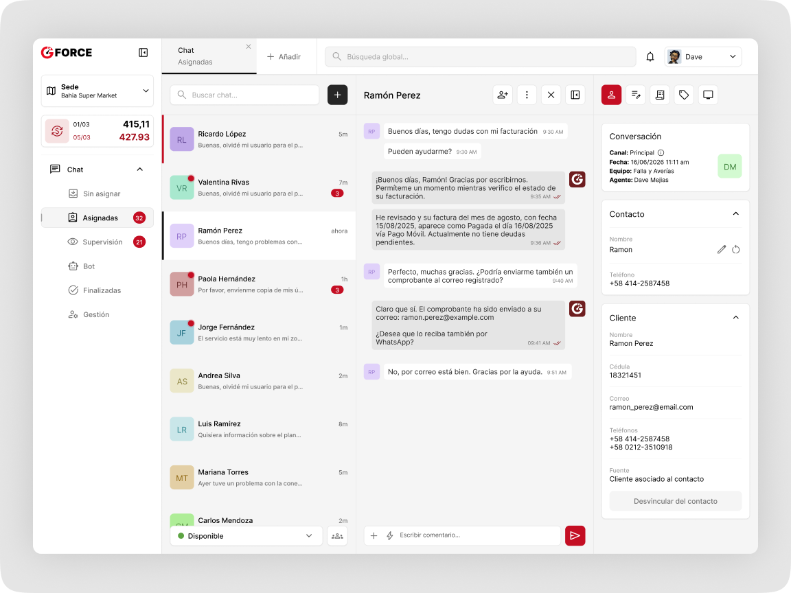
G-Office Chat interface with conversation list, active messages, and customer context panels
ImageChat Conversations

Key Design Decisions

Designing patterns that work across products

Rather than creating isolated solutions, I focused on reusable patterns that could work across the ecosystem.

Consistent actions

Primary and secondary actions follow the same hierarchy across products.

Predictable data presentation

Tables, filters, statuses, and metadata use shared structures to reduce unnecessary learning.

Context without interruption

Important information is shown close to the task, reducing the need to navigate between multiple screens.

Scalable components

Components were designed to support new modules, workflows, and product requirements without losing consistency.
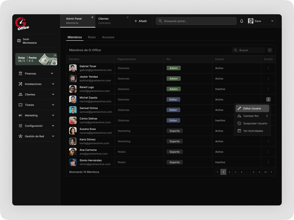
Dark G-Office admin panel showing members, roles, statuses, and a user action menu
ImageAdmin Panel

Outcome

A more connected product ecosystem

The result was a more consistent and scalable experience across G-Network’s digital products.

The design system created a shared foundation, while the redesigns made complex operational workflows easier to understand and manage.

Instead of treating G-Force, Mobile, and Chat as unrelated products, the work established them as connected parts of the same ecosystem.

Scalable components
  • A shared visual and interaction language
  • More consistent workflows across products
  • Clearer information hierarchy
  • Reusable components for future features
  • Better alignment between design and development
  • A stronger foundation for the ecosystem to grow
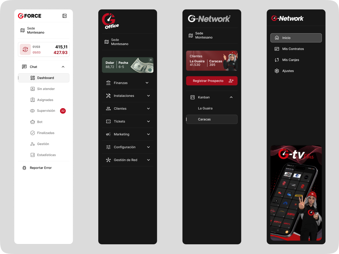
Four G-Network sidebar variations for desktop and mobile products
ImageSidebars

Retrospective

Designing the system behind the screens

The most important part of this project was understanding that consistency is not achieved by making every screen look identical.

Each product had different users, workflows, and constraints. The challenge was to create enough structure to make the ecosystem feel connected while allowing each experience to solve its own problems.

This project strengthened my ability to work across complex systems, collaborate with multidisciplinary teams, and design foundations that can support a product beyond a single release.

100%

Fomoless

Fresh internet news without the doomscroll

Fomoless news homepage with topic filters and curated story cards

My role

Product Designer & Builder

Product Concept, UX/UI Design, Visual Design, Interaction Design, and Frontend Development (AI).

Team

  • Solo

Link

Fomoless

Overview

Stay informed without getting stuck

Fomoless is a focused news experience that brings together fresh stories across AI, technology, science, social platforms, music, streaming, and entertainment.

I designed and built it to help people discover what matters, understand each story quickly, and move on—without endless feeds, noisy interfaces, or doomscrolling.

Timeline & Status

2026 · Designed, built, and launched

The Problem

Staying informed often becomes endless scrolling

People frequently rely on social platforms and crowded news websites to understand what is happening online.

Instead of helping users quickly catch up, these experiences often encourage continuous scrolling, repeated stories, distracting content, and information overload.

Users may need to:

  • Browse multiple websites and platforms
  • Move through unrelated or repetitive stories
  • Open several articles to understand one topic
  • Navigate interfaces filled with distractions
  • Spend more time scrolling than actually learning

The challenge was to create a news experience that provided enough content to stay informed without becoming another endless feed.

Fomoless desktop news feed with curated technology story cards
ImageCurated News Feed Experience

The Solution

A clearer way to explore what matters

I designed Fomoless around a curated feed of stories organized into clear categories.

Users can move between topics, scan the latest headlines, open a story, and understand its key information through a focused reading experience.

The interface keeps navigation and controls minimal so the content remains the main priority.

Core flow

Choose a category → Explore stories → Open an article → Understand the key information

Fomoless article preview with a concise AI-generated story summary
ImageArticle Preview & AI Summary

Key Design Decisions

Clear topic navigation

Stories are organized into categories such as AI, Technology, Science, Socials, Music, Streaming, and Entertainment.

This allows users to move directly toward the subjects they care about instead of navigating one mixed and overwhelming feed.

Scannable news cards

Each story card prioritizes the headline, image, source, and essential context so users can quickly decide what deserves their attention.

Focused article experience

Opening a story provides additional information without surrounding the user with unrelated content or unnecessary interface elements.

Quick summaries

Condensed summaries help users understand the main idea of a story before deciding whether to continue reading the original article.

Minimal interface

Navigation, filters, and actions remain visually quiet so the stories stay at the center of the experience.

Fomoless tablet layout showing categories and a compact grid of stories
ImageTablet News Discovery Experience

Final Experience

Designed for quick and intentional discovery

The final product gives users one place to explore fresh stories across several areas of the internet.

Users can open Fomoless, select a category, scan what is happening, understand the stories that interest them, and then move on with their day.

The experience avoids unnecessary accounts, complex configuration, intrusive notifications, and distracting interface patterns.

Fomoless article preview modal over a softly blurred news feed
ImageArticle Preview Modal

Outcome

A calmer alternative to the traditional news feed

Fomoless was designed and launched as a functional web product rather than a static design concept.

The finished experience provides:

  • One focused place for fresh internet news
  • Clear topic-based navigation
  • Scannable story cards
  • Concise article summaries
  • Focused article details
  • Desktop and mobile experiences
  • No login or unnecessary setup
Mobile Fomoless news experience with categories and story cards
ImageMobile News Discovery Experience

Retrospective

Staying informed should not require giving away your attention

The main challenge was finding the balance between discovery and restraint.

A news product needs enough content to feel useful, but not so much visual noise or friction that users lose control of their attention.

Fomoless reinforced the value of designing experiences that help people understand more while scrolling less.

Mobile Fomoless article preview with an AI summary and original-source action
ImageMobile Article Preview & AI Summary
100%

Thumbnail Grabber

A faster way to save any YouTube thumbnail

Thumbnail Grabber interface for previewing and downloading a YouTube thumbnail

My role

Product Designer & Builder

Product Concept, UX/UI Design, Visual Design, Interaction Design, and Frontend Development (AI).

Team

  • Solo

Overview

Download any YouTube thumbnail in seconds

Thumbnail Grabber is a lightweight web tool that lets users paste a YouTube URL, preview the original thumbnail, choose the preferred resolution, and download it instantly.

I designed and built the product to replace manual URL editing, unreliable tools, and low-quality screenshots with one simple, focused flow.

Timeline & Status

2026 · Designed, built, and launched

The Problem

A simple task with too many unnecessary steps

Downloading a YouTube thumbnail should be straightforward, but the existing process is often confusing or inconsistent.

Users may need to:

  • Search for external tools
  • Modify the YouTube URL manually
  • Navigate through cluttered websites
  • Download low-quality images
  • Take screenshots instead of obtaining the original file

The challenge was to create a tool that made the action immediately understandable without requiring instructions.

Thumbnail Grabber desktop flow with a YouTube link field and generated thumbnail
ImageYouTube Thumbnail Download Flow

The Solution

A focused single-task experience

I designed the interface around one primary action: pasting a YouTube URL.

Everything else appears only when it becomes relevant.

Before processing a link, the interface clearly explains what the user needs to do. Once the thumbnail is generated, the product reveals the preview, available resolutions, and download action.

This keeps the experience simple while still giving users control over image quality.

Core flow

Paste URL → Generate thumbnail → Select resolution → Download

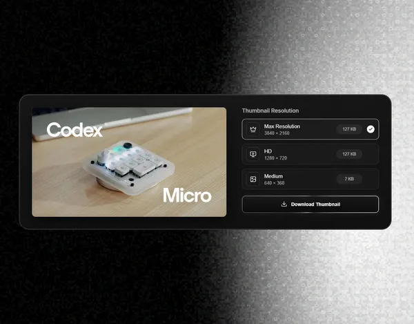
Generated YouTube thumbnail with max, HD, and medium resolution options
ImageThumbnail Preview & Resolution Selector

Key Design Decisions

Keeping the product intentionally simple

The URL input is the primary focus of the page, making the purpose of the tool immediately understandable.

Contextual interface states

The empty state explains what will happen before the user submits a URL. The result state then introduces only the controls needed to finish the task.

Resolution control

Users can choose between the available image qualities instead of receiving a single predetermined file.

Visual focus

The generated thumbnail remains the central element of the result, while secondary controls stay visually quiet.

Tablet Thumbnail Grabber flow with a generated YouTube thumbnail
ImageTablet Thumbnail Download Experience

Final Experience

Designed to complete the task in seconds

The final product removes unnecessary navigation, accounts, settings, and distractions.

Users can open the tool, paste a link, select the image quality, and download the thumbnail within a single page.

The result is a lightweight utility designed around speed, clarity, and a specific user need.

Tablet Thumbnail Grabber preview with selectable download resolutions
ImageTablet Thumbnail Preview & Resolution Selector

Outcome

A small product with a clear purpose

Thumbnail Grabber was designed and launched as a functional web product rather than a static design concept.

The finished experience provides:

  • A direct single-page workflow
  • Clear empty and result states
  • Multiple thumbnail resolutions
  • High-quality image downloads
  • A responsive interface
  • No login or unnecessary setup
Mobile Thumbnail Grabber flow with a YouTube link and thumbnail result
ImageMobile Thumbnail Download Experience

Retrospective

Removing steps is also a design decision

The main challenge was not adding more features. It was identifying the shortest path between the user’s intent and the final downloaded image.

Thumbnail Grabber reinforced the value of designing focused products where every element supports one clear action.

Mobile Thumbnail Grabber preview with three image resolution choices
ImageMobile Thumbnail Preview & Resolution Selector
100%